The Process
A Peek into my Design Process
Foundational Research
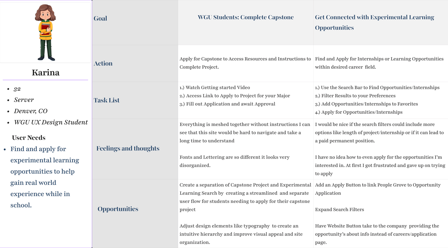
User Research Study
Questions Asked
•Demographics: Age, WGU email, Student Status
•When navigating People Grove, what benefits do you see that excite you?
•When navigating People Grove, are there any areas where clarity could be improved?
•How was your experience in achieving the goals of finding and applying for experimental learning opportunities?
•When navigating the site, what main features did you explore or use?
•When navigating the site, what main features did you explore or use?
•Are there any areas where accessibility can be expanded or improved so that users with different needs can benefit from Experimental Learning?
Insights Gained
The majority of participants
•Were between the ages of 30-40 and are currently enrolled in WGU.
•Show excitement for career and personal development opportunities or internships
•Struggled with navigating the site to complete their capstone, search EL Opportunities, or understand its purpose. Most students were not able to find how to apply for EL Opportunities.
•Found the simplistic design visually unappealing
•Stated that when addressing accessibility, font size and hierarchy would be helpful as well as simplifying the dashboard.
"The platform is very confusing. It’s hard to know where to go when you’re trying to complete your capstone."
User Journey Map
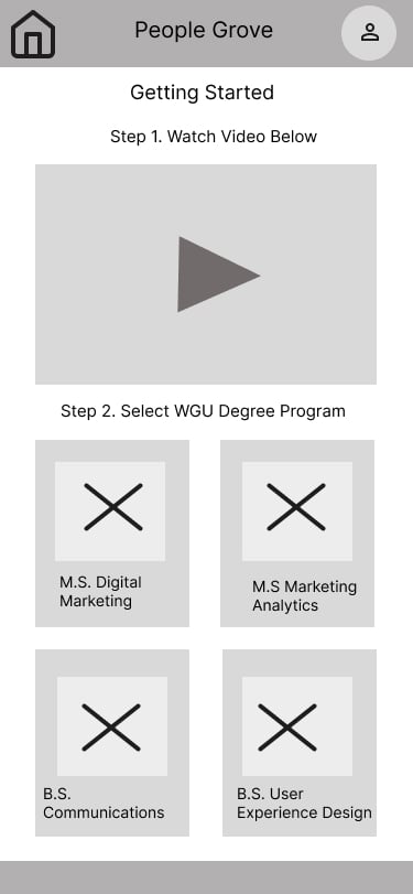
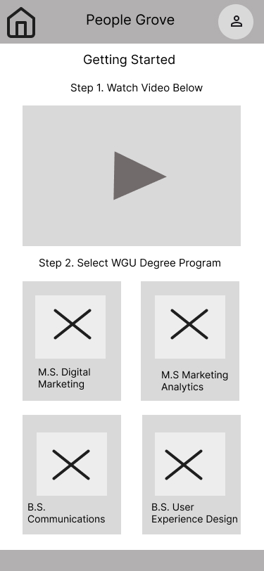

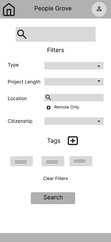
Creating the Wireframe Based On Feedback

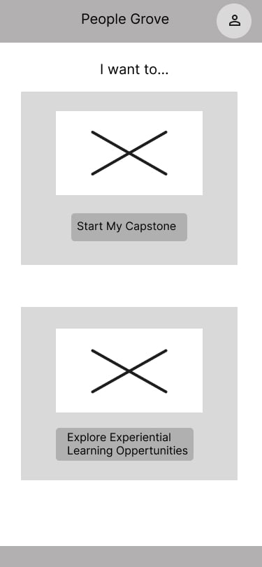
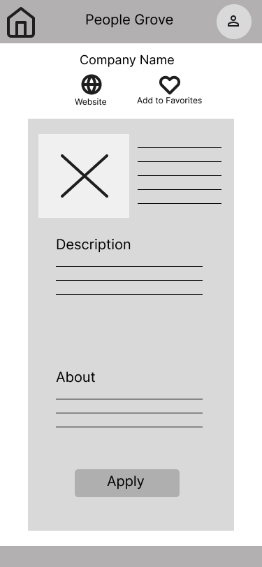
Using feedback from my usability study, I updated the dashboard to segment the two main parts of the People Grove Dashboard. The Start page includes photos to make it more visually appealing.
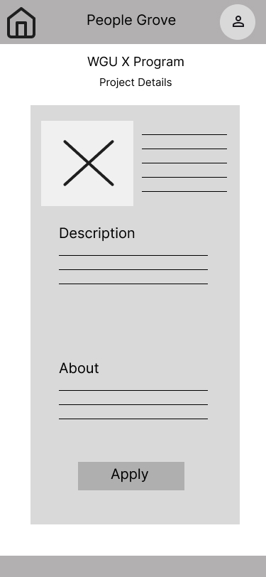
Users who need to complete their capstone project are brought to a Dashboard that has the instructional video and Images related to the degree program, which, when tapped by the user it will bring them to an application page.
Users are shown their specific courses capstone project details can click Apply when ready to progress to next step