
Capstone Project: Improving Website and Mobile Design
Project Goal
To improve the mobile app design so that more students can easily connect with companies offering experiential learning opportunities or efficiently complete their WGU capstone projects.
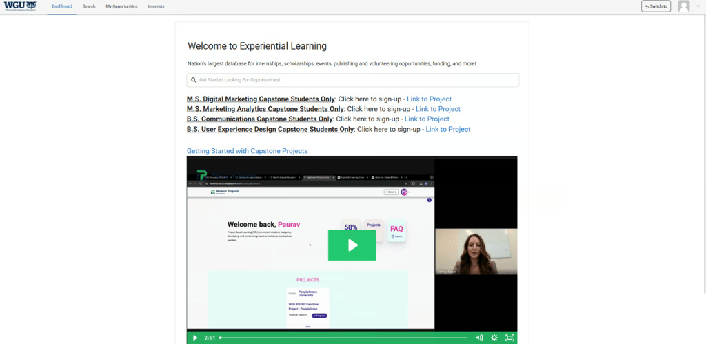
Original Home Page
Original Designs
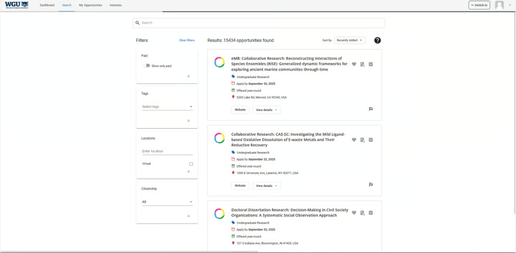

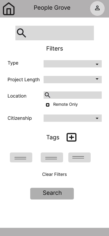
Original Search Results Page

User Journey Map
To identify users' pain points when navigating the website, I created a user journey map
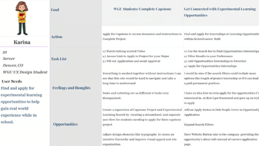
Insights Gained
The majority of participants
Ages 30-40 and are currently enrolled in WGU.
Show excitement for career and personal development opportunities or internships
Struggled with navigating the site to complete their capstone, search for Experimental Learning Opportunities, or understand its purpose. Most students were unable to find how to apply for EL Opportunities.
Found the simplistic design visually unappealing
Stated that when addressing accessibility, font size and hierarchy would be helpful, as well as simplifying the dashboard.
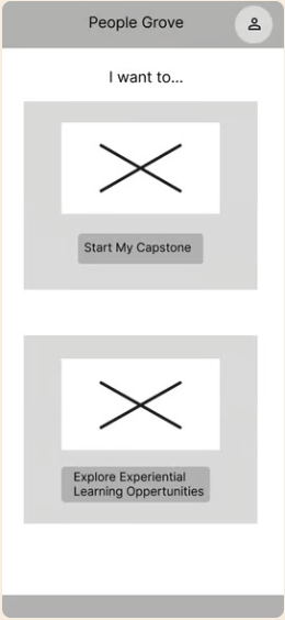
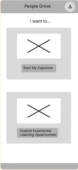
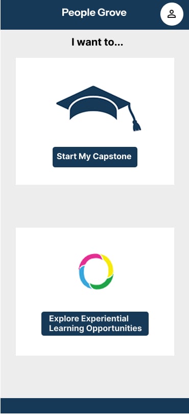
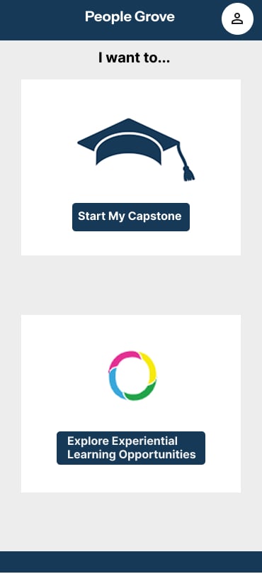
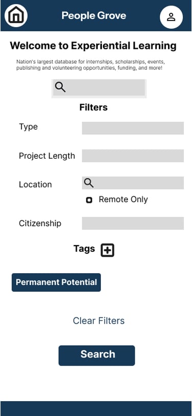
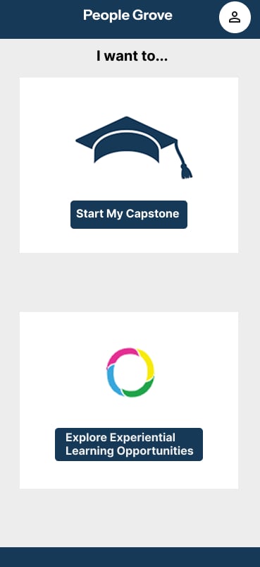
Home Page
Using feedback from my usability study, I updated the starting page to segment the two main parts of the People Grove Dashboard: Capstone projects and Experimental Learning. The home page also includes photos to make it more visually appealing.
Foundational User Experience Research
Questions Asked
Demographics: Age, WGU email, Student Status
When navigating People Grove, what benefits do you see that excite you?
When navigating People Grove, are there any areas where clarity could be improved?
How was your experience in achieving the goals of finding and applying for experimental learning opportunities?
When navigating the site, what main features did you explore or use
When navigating the site, what main features did you explore or use
Are there any areas where accessibility can be expanded or improved so that users with different needs can benefit from Experimental Learning?
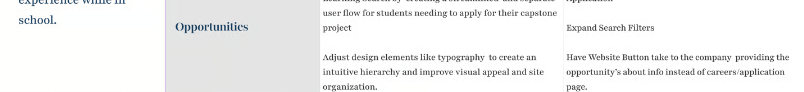
Planning Improvements Based on User Feedback
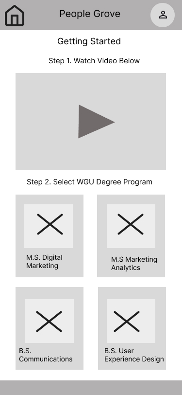
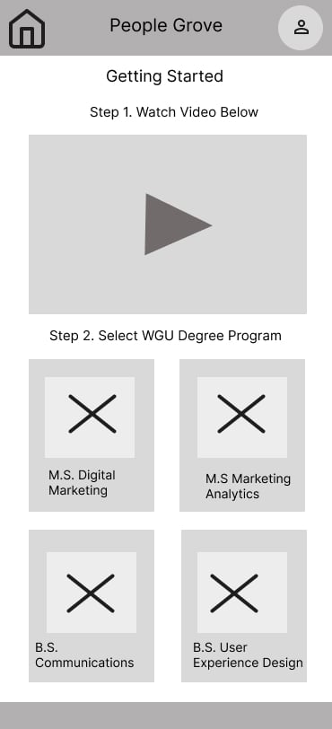
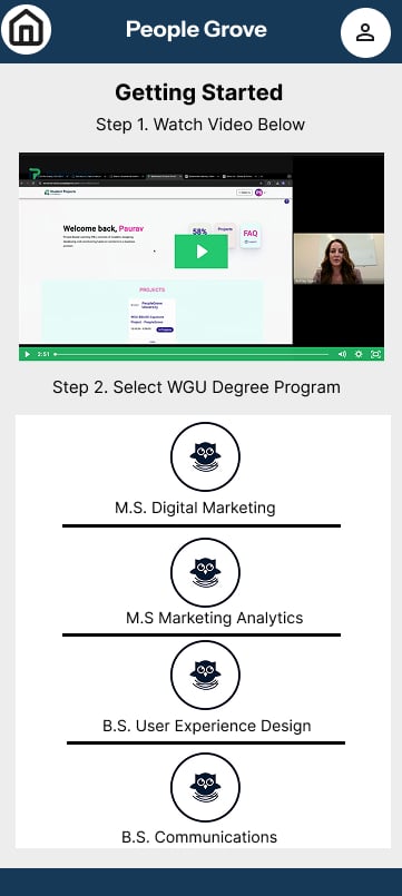
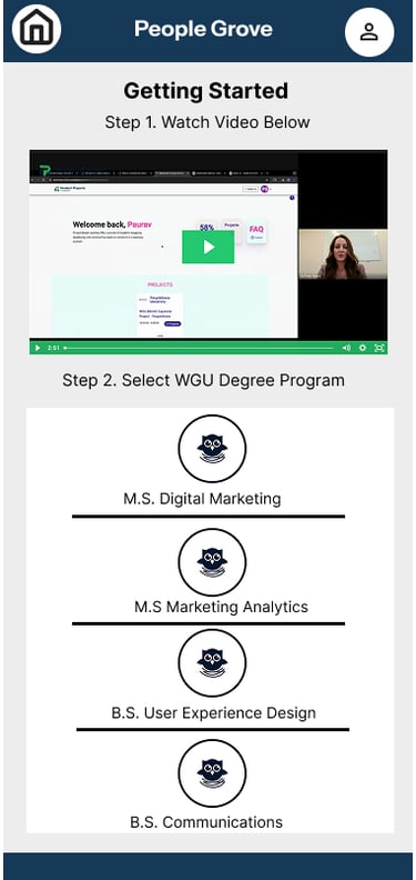
Capstone Dashboard
Users who need to complete their capstone project are brought to a Dashboard that has the instructional video and Images related to the degree program, which, when tapped by the user it will bring them to an application page.

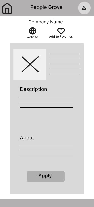

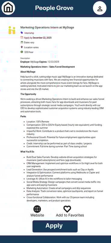
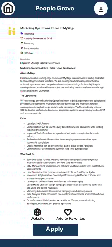
Improving User Flow for Experimental Learning
Opportunity
I updated the Detailed overview of the project to include an APPLY button that will bring the user directly to the application. The website icon will take users to the company’s about page. If they do not want to apply immediately, they can add the company to their Favorites
Home Page
Search
Using the feedback from my usability study, I added the option to select the desired project’s time length

Updated typography and color scheme to not only be cohesive and in alignment with the company's branding, but also to expand the accessibility of the mobile app
Ensured User flows are so intuitive that even Students battling burnout can easily navigate the People Grove website to either connect with Experiential Learning Opportunities or complete their capstone project with ease
Final Improvements
Used to make high fidelity and low fidelity design mockups that can be used as a blueprint for your design team to implement
Users can test design and give feedback for editing before final design is made